Clio
Clio is a hypothetical time travel company that offers trips to 200+ locations/times in the past.
Overview
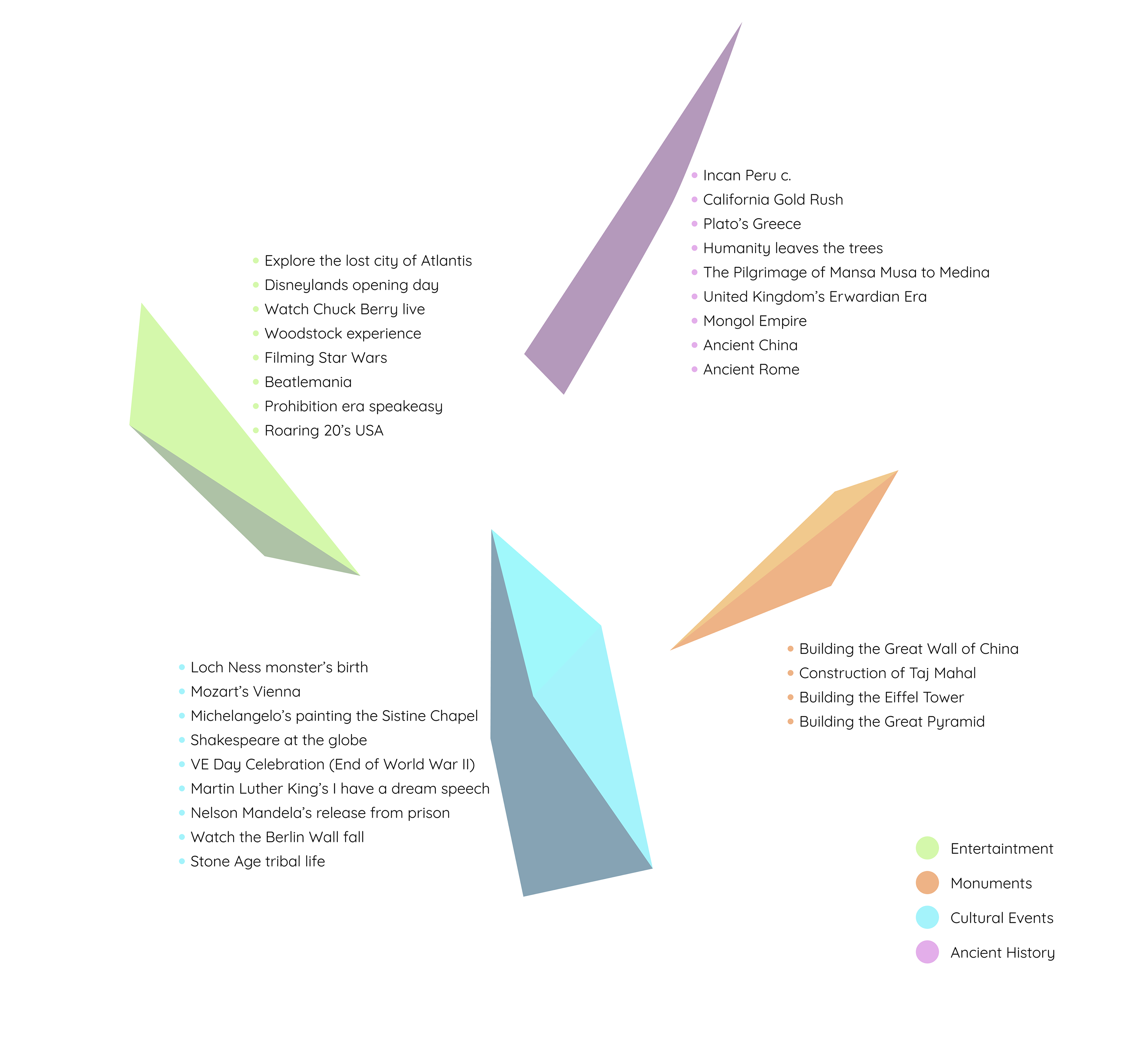
Clio is a hypothetical time travel company that offers trips to 200+ preselected locations/times in the past, such as Mozart’s Vienna, the building of Pyramids of Giza, and the Jurassic world in Australia. The length of the trips is predetermined based on the complications of time travel.
Constraints
I had to rely on assumptions to do market and user research since time-travel doesn’t exist.
Role
User Research, UX & UI Design, Prototyping, User Testing
Users and audience
- Adventurers
Tools
Figma, Adobe Photoshop, OptimalSort
Overview
Clio is a hypothetical time travel company that offers trips to 200+ preselected locations/times in the past, such as Mozart’s Vienna, the building of Pyramids of Giza, and the Jurassic world in Australia. The length of the trips is predetermined based on the complications of time travel. I chose to create a hypothetical time travel company as a project because of my interests in exploration and appreciation for history. I love learning about different cultures, and what better way to do that than to be physically transported to some of the most crucial events in a culture's history. Clio could serve as an amazing learning experience and vacation all in one.
Users and Audience
Currently time travel doesn’t exist, and Clio is hypothetical making it difficult to pin down the initial target audience. There are no customers with previous experience, and therefore the research phase of this company relies heavily on indirect competitors and user research based on travel companies.
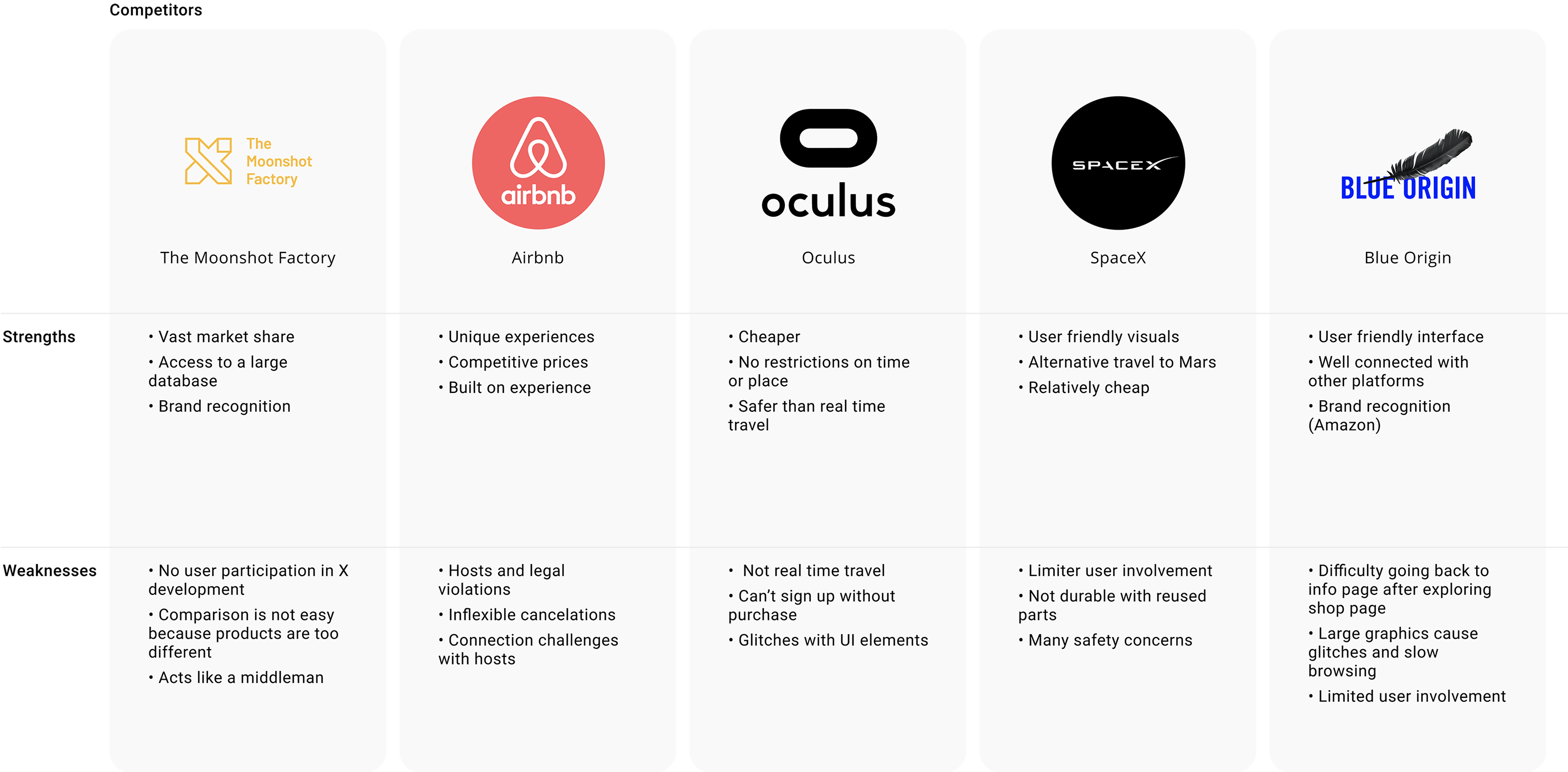
Since Clio is a hypothetical company, it has no direct competitors. Therefore I asked myself what Clio shares with other companies. It was concluded that even though Clio is unique when it comes to its offerings, it targets one thing: the vacation time of its users. Traveling to the past is after all a trip, therefore Clio indirectly competes with companies like Airbnb. Additionally, I identified that Clio indirectly competes with VR companies such as Oculus for a cheaper experience, and Blue Origin and The X development for their efforts in the space industry.