
An automated greeting card service with a personal touch

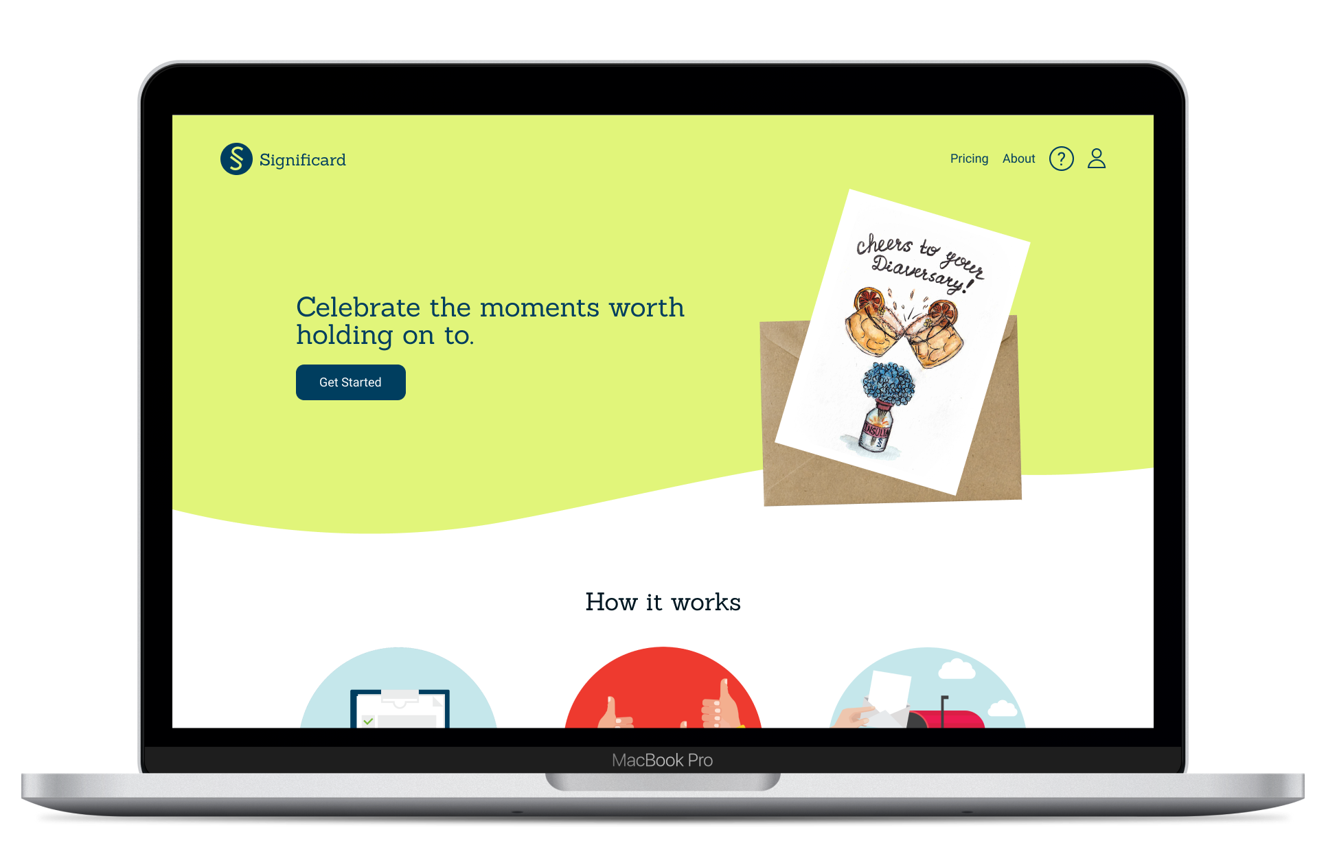
Significard is a web application that schedules, picks, and mails personalized eco-friendly cards using a combination of AI and real artists to make staying connected with your loved ones that much easier.
My Role
: User Research, UX & UI Design, Prototyping, User Testing, Product
experience, Product Strategy
Team Members
: Fabricio Guardia (Development), Ekaterina Taunova (Stakeholder)
Figma, Adobe Photoshop, Maze.co
One of my college classmates and also a close friend approached me about her small
business sending out personalized greeting cards. We expanded upon her idea for customized cards and theorized
about a tech based automated greeting card business which we would later call Significard. Significard utilizes
our custom designed quiz and AI technology to match a recipient with the perfect card that always arrives on
time. The ultimate goal was creating not only a customized, but also fool proof automated system to make sure
you never forget to send a card to loved one for any specified occasion. I was involved in the naming of the
company, designing the logo, and creating the entire UX design of the website. It has been quite the journey
starting from first base and bringing the product to launch. As a startup who didn't know the market as well, we
decided that step one would be to learn as much as possible about our competitors and target market. Competitive
analysis, user interviews and surveys helped us understand what type of market we are in, and what are the pain
points of our users.
Competitive Analysis and user interviews helped us determine that traditional solutions of buying greeting cards
at the grocery/card store were outdated, and that a text message was too impersonal. People are busier now than
ever but crave traditional methods of communication and appreciation.This left the more niche set of competitors
as mostly online based greeting card companies We were able to narrow the scope of forward thinking competitors
to a select few pictured below:
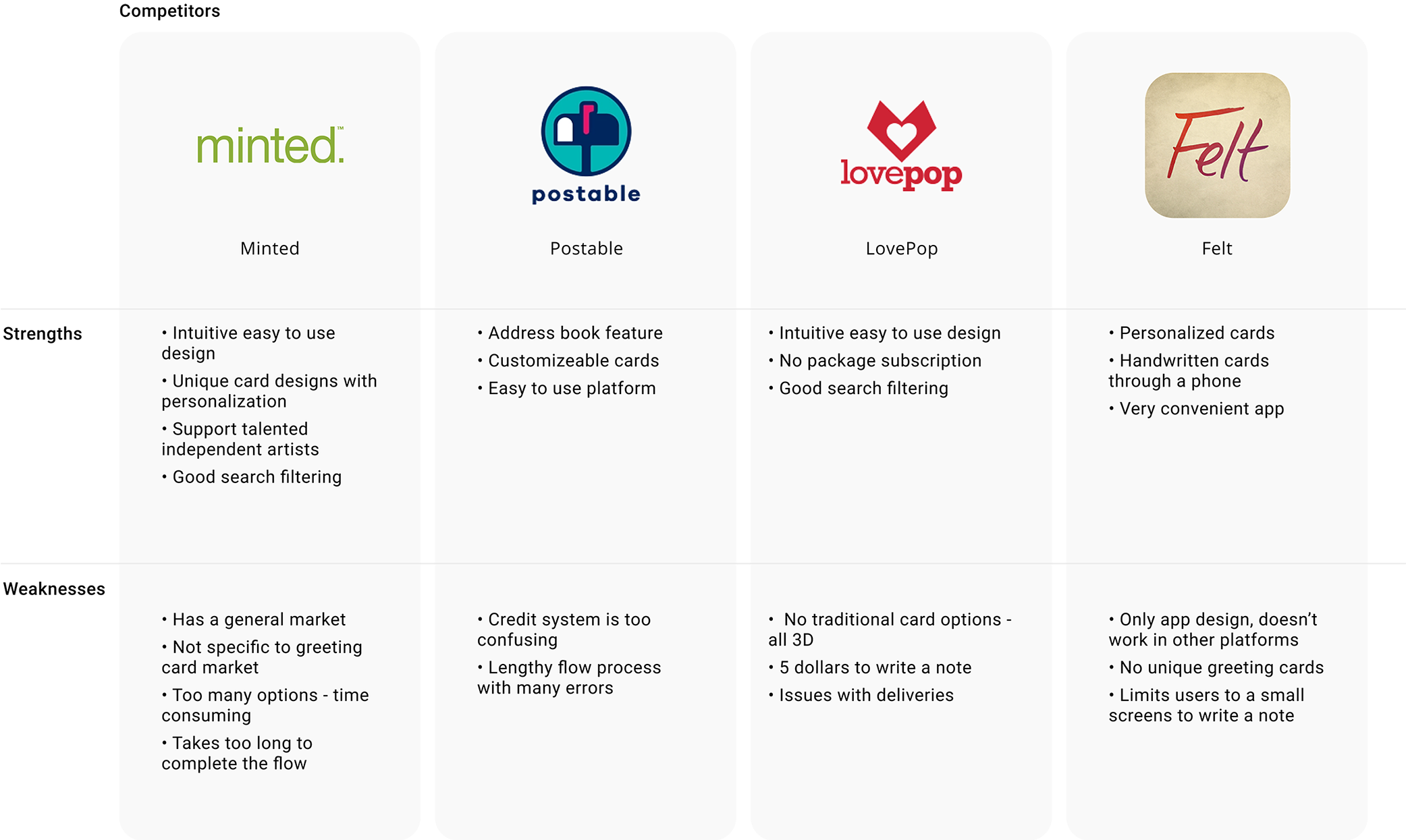
To Identify a core demographic for users we conducted market research to see what type of people purchase and/or appreciate greeting cards.This included surveys of potential users and interviews.The core target market that emerged was millennials. Millennials were old enough to appreciate the gesture of sending and receiving greeting cards while also being tech savvy enough to purchase them online. Younger demographics were not at the age of sending thoughtful cards yet, while older generations had not fully adopted technology. Additionally, we found that millennials are typically the busiest cohort due to having careers and families, thus they were most likely to forget to send a card or simply not have the time. Therefore, millennials would most benefit from our automated service.
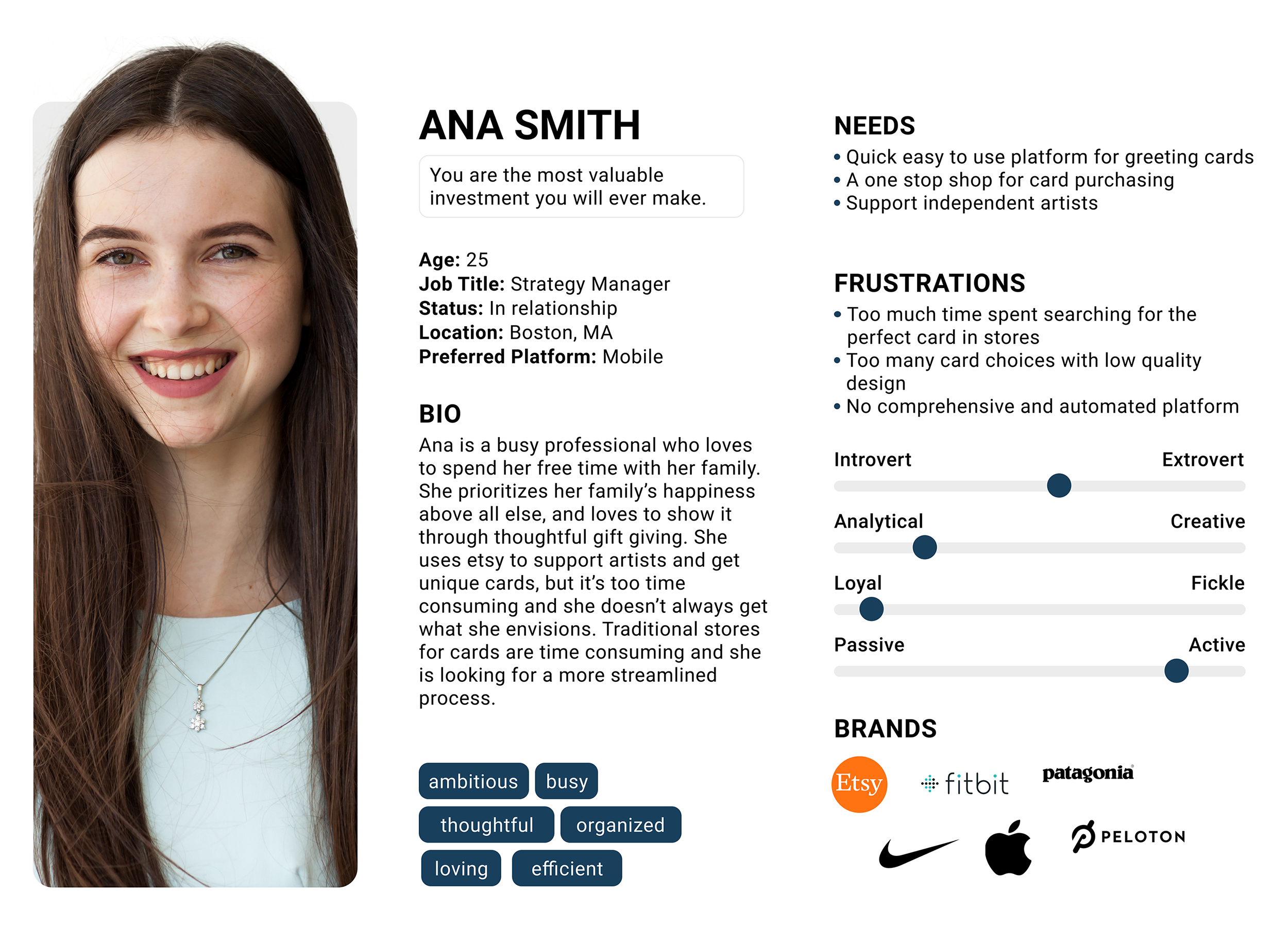
Once we were able to identify the target market this helped shape the goals for that persona, which in turn helped design Significard as a beneficial service that appeals to those who have many connections, are mature, busy, and tech savvy.
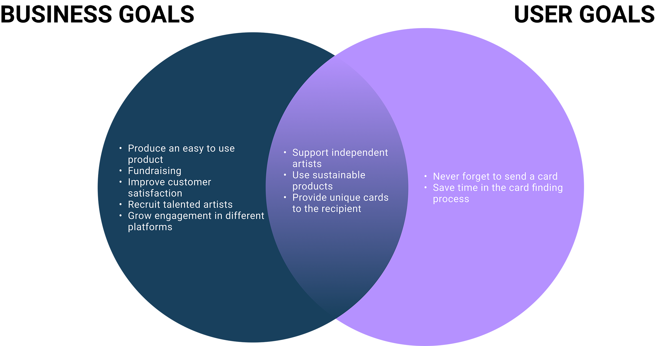
With all that in mind we were able to define the goals of the business and users and define the product of Significard as a made to order greeting card subscription service that matches users with unique cards that they struggle to find in a commercial store. When the user arrives on the landing page they are prompted to take a short card matching quiz which provides Significard the necessary information (date, recipient, preferences, style) to automate the entire greeting card process. For example, If I want to send a card to my mom every year for her birthday, I can take the quiz and write down my mom’s unique preferences for that event and then let Significard do the rest. Later, I can add more recipients and events in the profile to set me up for success in the coming year when it comes to sending greeting cards to all the important people in my life for each significant event making last minute card shopping a thing of the past. This subscription service makes the experience of giving cards a lot more customized by printing the names of recipients in front of the cards. Additionally, the cards will automatically be sent out before the date of the event making sure that the user never forgets to send another card again.
Over 90% of millennials own a smartphone meaning a mobile app is key to compete for sales within this user demographic. In order to provide the best user experience and create an immersive design a mobile app became crucial for Significard's success. The mobile app allows the business to maximize the amount of time user's can interact with Significard's product and the only screen the millennials always have with them is the smartphone. Therefore, we decided to adapt the desktop design into a mobile app.

We tested 5 users for the desktop version, and 4 users for the mobile app. Users were prompted to take the quiz and order one card to one recipient through Significard. %89 of the users were able to complete the prompt successfully, but some were confused about certain parts of the quiz. Users did not want to pick just one type of card for one person as personalities are fluid depending on the situation. This made us change the style of question from picking an answer to ranking all the choices from what best suits the recipient to least.
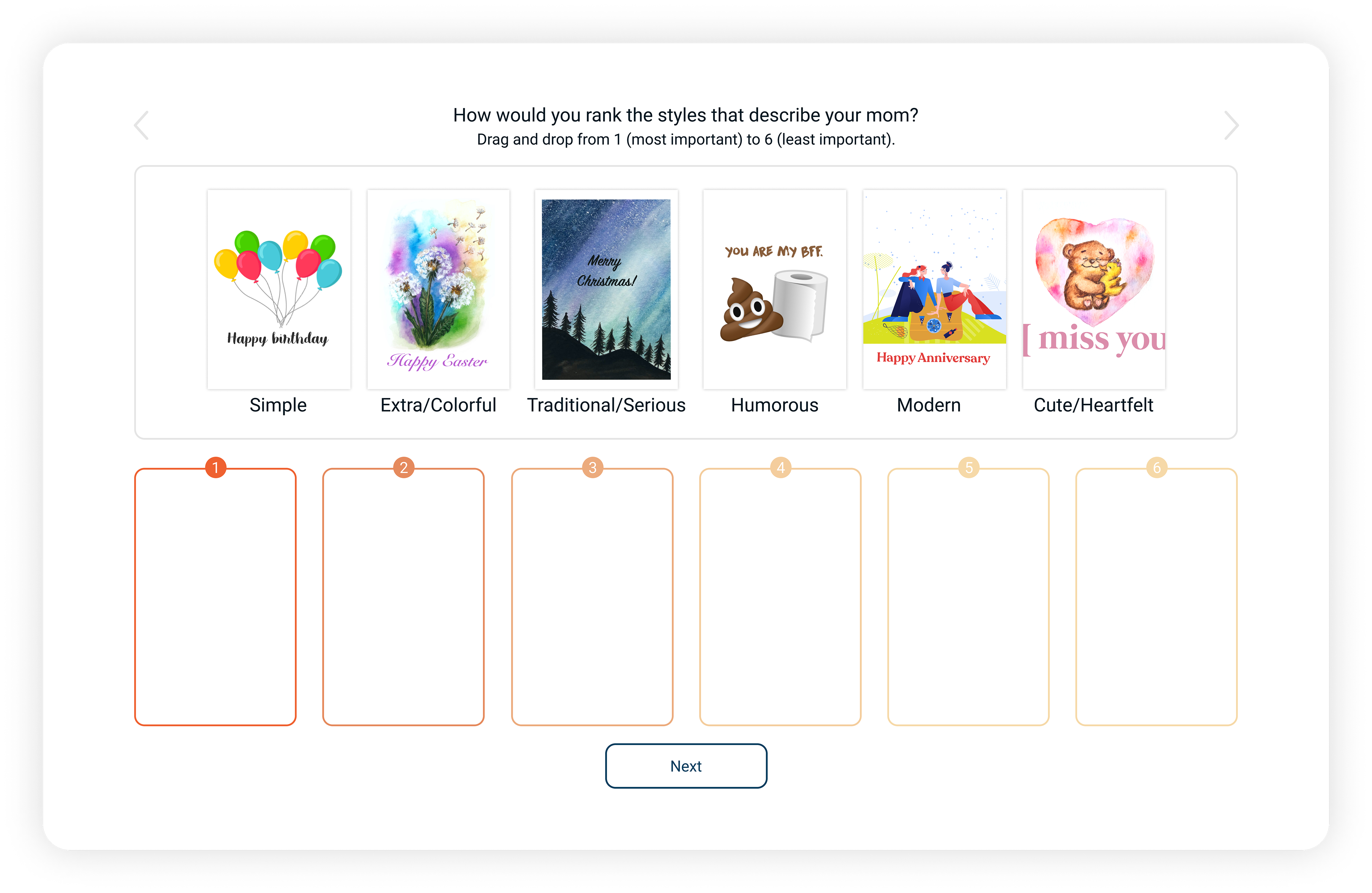
A greeting card company can still be relevant in today’s current market as long as it adopts technology, is easy to use, and is customized to meet its user’s needs and style. While it was difficult to design an automated subscription service that is customizable, the benefit will be seen in the NPS of the website and user retention. Significard will have better brand loyalty as the product is designed specifically for each user while also limiting the amount of effort required by the user. We learned that the questions of the quiz need to be easy to understand and answer to avoid dropoff during that process. Once a user is in the Significard network the repeat purchases make it a sustainable business model. We learned that having graphics, drag and drop options, and limited open text responses made it more likely for users to complete the initial quiz. Clear wording was crucial in understanding exactly what the product does, and led to a happier customer as they knew exactly what value the service provided.
In conclusion, there is clear value in what Significard has to offer. The key to getting and retaining customers is to display that value in clear and concise messaging. Additionally, Consumers like limited interaction, but also like having the ability to customize the product they are sending. I was glad we were able to create a product that could meet different types of users needs with a fun and interactive quiz that is only required once during the onboarding process. The benefits of the subscription model become very apparent after that stage as the company enjoys recurring revenue while the user enjoys ease of mind that their friends and family will always get a personalized card to celebrate significant occasions. The most impressive part is we made this possible for the user without ever having to leave the couch.
Other Projects