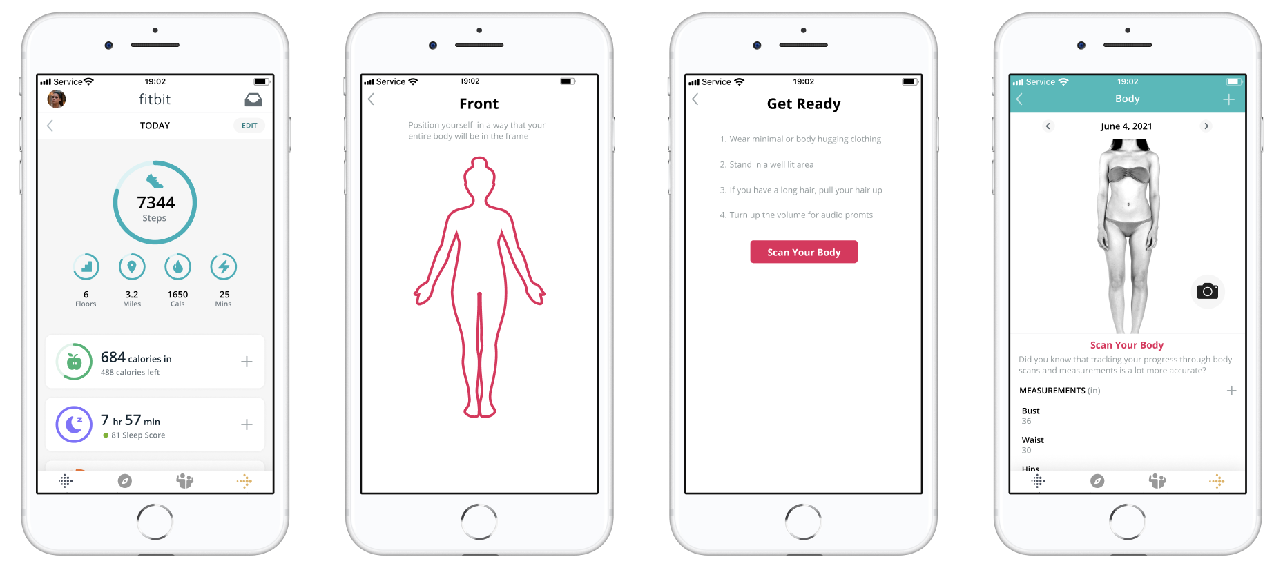
Fitbit is a health and fitness app that uses wearable technology to achieve progress for its users.

Fitbit is an industry leader in wearable technology including software and applications that help people track their activity, health habits, and set goals in order to transform their lives for the better. In order to help acheive the goals of the company, I implemented the Fitbit body scan feature which will further help users track their health progress so that they can see and celebrate the changes they have made to their body and health right in the already existing app.
User Research, UX & UI Design, Prototyping, User Testing
Figma, Adobe Photoshop
Stepping on the scale can be a stressful experience. However, weight loss and
maintenance are long-term processes that require consistent effort on a daily basis, and it's not fair to judge
your achievement solely on one number.
I am a long-time user of the Fitbit and Fitbit app. The Fitbit app allows its users to connect real-life data to
their app, which helps them set long-term health goals. I was able to shed some of my unwanted weight and
establish a workout routine that stuck around. However, Fitbit also caused me to have a slight obsession with my
weight as I started losing weight. Establishing a new routine with workout and weight loss, users need to check
their Fitbit app every day to make sure they’re on track. They count calories, check their active minutes, their
sleep schedules, and mindfulness. Seeing the numbers causes people to obsess over calories and weight, which in
return causes more problems long term.
How do I keep myself on track while preventing myself from obsessing over the numbers? Research suggests that
regular body scans along with measuring yourself are a better way of keeping track of your body instead of
weight. Weight doesn’t count for the amount of muscle or fat, and we can all look different with the same
weight. So I decided to stop weighing myself and instead track how my body looks through photos and measuring my
body.
I scoured the internet and tried to find an app that scanned my body and took my measurements all in one place since they go hand in hand. Though some apps tackled 3D body scanning, they were hard to use and with many steps. Some apps (such as body ID) guessed your size based on the photos, but the many steps and the inaccuracy caused me to have a headache over the 20 minutes I’ll never get back.
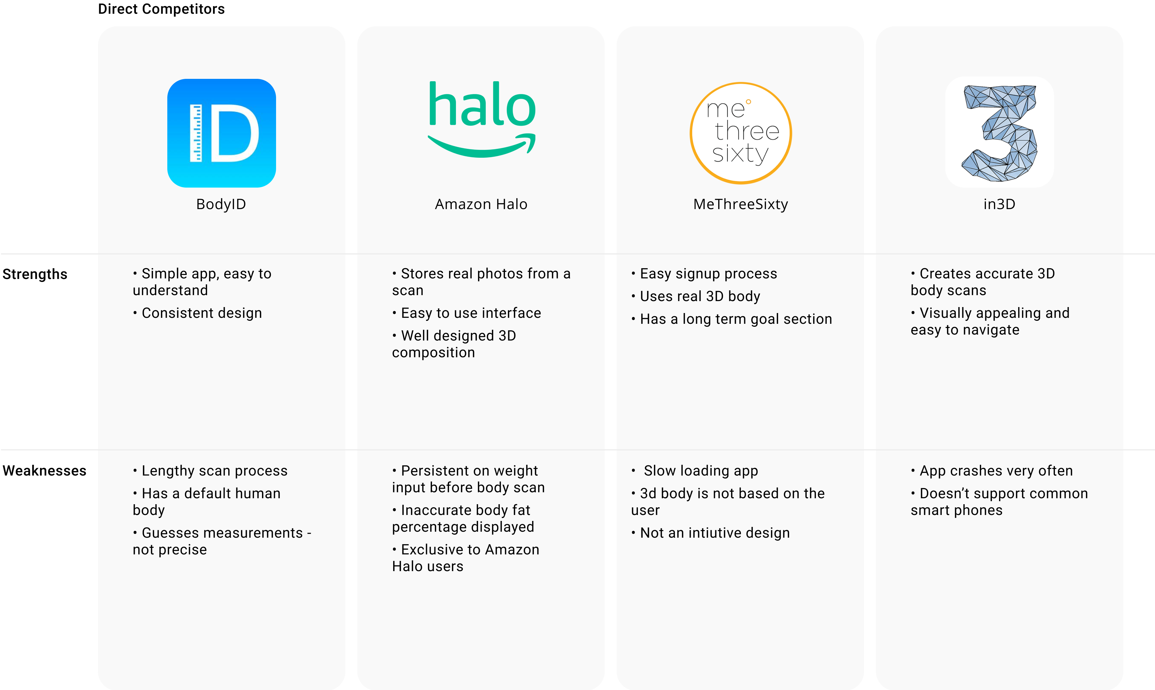
So I decided to take the dive and brainstorm how this functionality would look
like in the Fitbit app.
I was able to utilize the findings of my research about the importance of body scans to model the details of the
body required for understanding health without overcomplicating the process with too many stats. Instead I
created a simple process that adds body tracking right inside the fitbit app using the phone camera. There is no
complicated measuring process, inaccurate estimations, and improper health assumptions. By simply making the
process a few photos from a few different angles, the user doesn't have to spend precious time measuring
themself or inputting overwhelming data. Instead, those metrics are an optional feature so you can have that
level of detail if you would like, but I do not require it in these features like many other apps do. This way
the user is presented with the level of detail they are interested in, and can get the most accurate reading of
their progress in a non-intrusive way.
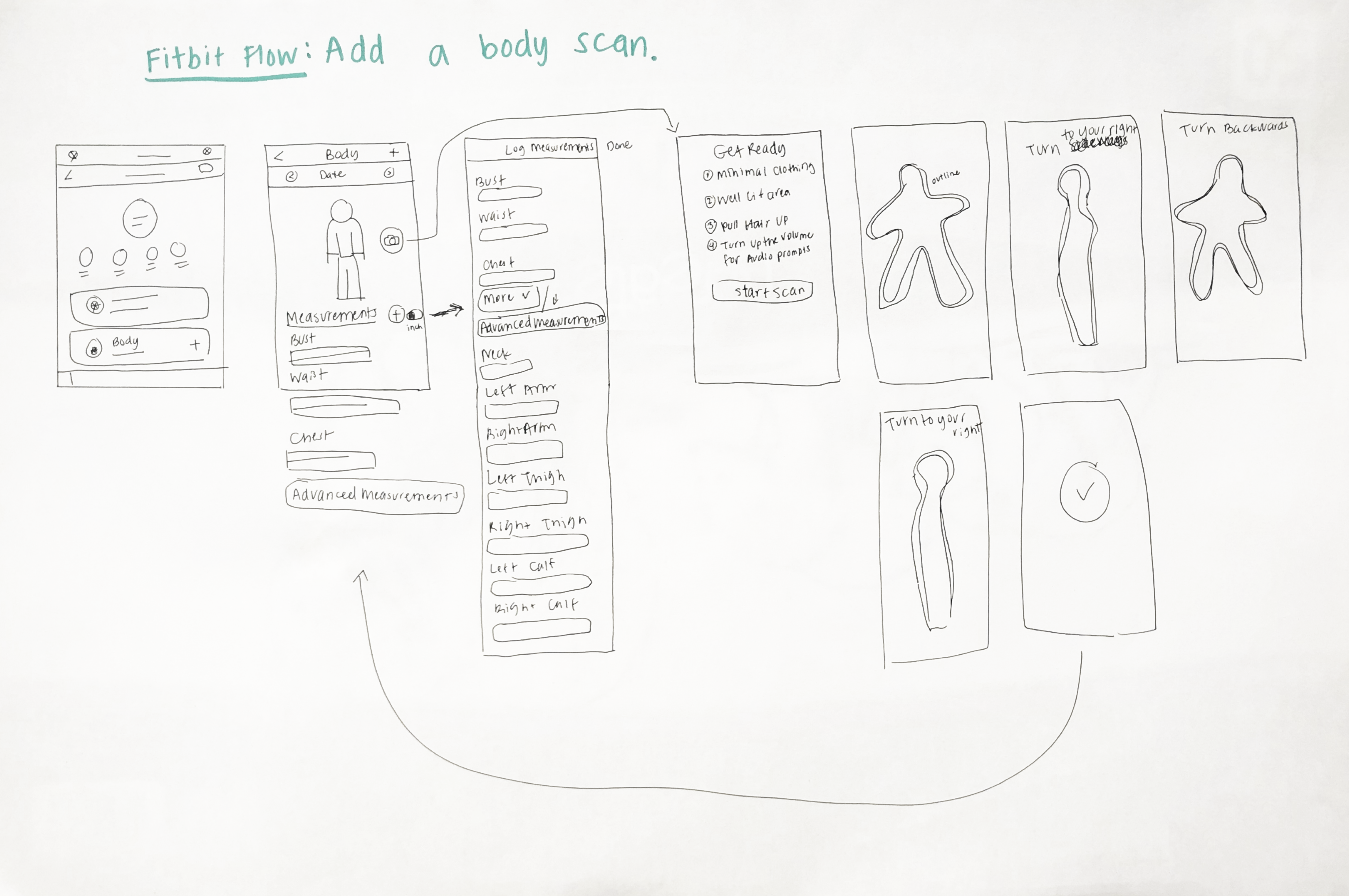
Next step was to build the prototype. To do that, I recreated the fitbit app
through screenshots and downloading fitbit fonts through their online platform. Then I sketched body icons for
the new feature based on their existing icons so that I can move on to recreating the new pages.
I kept the colors and fonts consistent with the fitbit app. The body feature required users to either add body
scan, add measurements or do both. I placed the body scan part on the top since it was the most important
feature on this part. The Measurement section was placed on the bottom. Users could add their measurements the
same way they log calories in the app - through the plus sign on the top part. Consistency was key since this
app feature is made for the existing users who are already familiar with the app.
To test this, I did a usability test with 7 users. Their prompt was “Do a body scan and then add your
measurements in the Fitbit App”.

The usability test was very smooth and successful. All of the users passed the test with the exception of two
users who complained about the color and the size of the plus sign. To keep elements consistent with the
original app, I decided to not change the size of the plus sign. Instead I increased the touch target area of
the sign by adding an invisible layer underneath so users can press the plus sign successfully. Keeping the
consistency of the app was very important in this area, especially because users have already taken the time to
learn the app, therefore this new feature needed to function in a similar manner. Users were presented with an
intuitive design so as not to force them to learn something completely new. Consistency of design for this
feature within the Fitbit environment will save time, and money for Fitbit.
When I first initiated the prompt to the users, one of them said “oh god, do I have to weigh myself?”. This
summed up the struggles of current and prospecting fitbit app users who want to improve themselves but are
afraid of being triggered by the scale.
Through this process I learned that users enjoy the ability to track their own body and health in a personalized
way that doesn’t overwhelm them with data, numbers, and effort. We know that just weight or BMI is not an
accurate picture of one’s health, so I figured, “why not use an actual picture?” User’s loved the idea of only
having to enter the details they wanted, and how easy it is to see their body improve over time through a
graphical representation. With this new feature we are able to say goodbye to overcomplicated measurement
entries, and capitalize on the technological advancements of modern phones' ability to create accurate 3D
images. You are able to see your actual body change overtime in a seamless manner within an app dedicated to
your body and health.

This simplified body tracking feature will increase user retention and create an inclusive product that will be more psychologically customized to the unique needs of each individual. This app solves the one-size fits all approach to health tracking by measuring progress rather than fitting people into a singular health scale. To sum it all up, users like products to be customized to meet their unique needs, enjoy simple and consistent processes, and prefer graphical representations rather than being inundated with large amounts of text.
Other Projects